
Brand Showcase · HVAC · Residential & Light Commercial
Joe Dirt HVAC: One Brand, From the Logo to the Lawn Sign
A complete identity for a heating and cooling contractor that wants to be the company homeowners call first, and the one they don't argue with on price. Logo, fleet, website, paperwork, apparel and social, built as one system.
01 · Brand Overview & Creative Direction
Positioned as the Premium, Trusted Choice
Most HVAC companies look the same: a clip-art snowflake, a red-and-blue logo and a truck with a phone number slapped on the side. Homeowners can't tell them apart, so they pick on price. The direction for Joe Dirt HVAC was the opposite. Look like the established company in town, the one that shows up in a clean truck, hands over a real estimate folder and doesn't need to be the cheapest.
The name has personality, so the design had to carry it without turning into a joke. A shield crest, heavy Poppins type and a tight four-color palette keep it serious enough for a full system replacement conversation and memorable enough that a neighbor remembers it a week later.
The Brief, In Plain Terms
- Serve homeowners and light commercial accounts (offices, small retail, restaurants)
- Look established and safe to let into the house
- Separate heating and cooling visually in one mark
- Work at every size: embroidered cap, invoice header, 20-foot van
- Point every piece of material back to one phone number and one website
02 · The Logo System
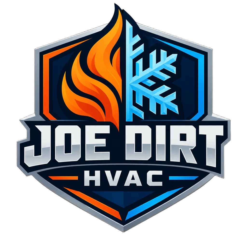
The Shield Crest
A shield says protection and permanence. Inside it, a single flame splits into an ice crystal, so heating and cooling live in one shape instead of two competing icons.
Typography · Poppins
Aa Bold 800
Headings 600
Body copy in Poppins Regular for estimates, letters and the website.
Midnight Navy
Primary field color. Trucks, site header, apparel, sign faces. Reads as established and serious.
Fire Orange
Heating, urgency and every call-to-action. Used sparingly so it always points to the phone.
Ice Blue
Cooling and trust accents: review stars, badges, secondary highlights.
Chrome Silver
Borders, the crest outline and hardware-style detailing. Ties the system to the equipment.
03 · Commercial Vehicle Fleet Wrap
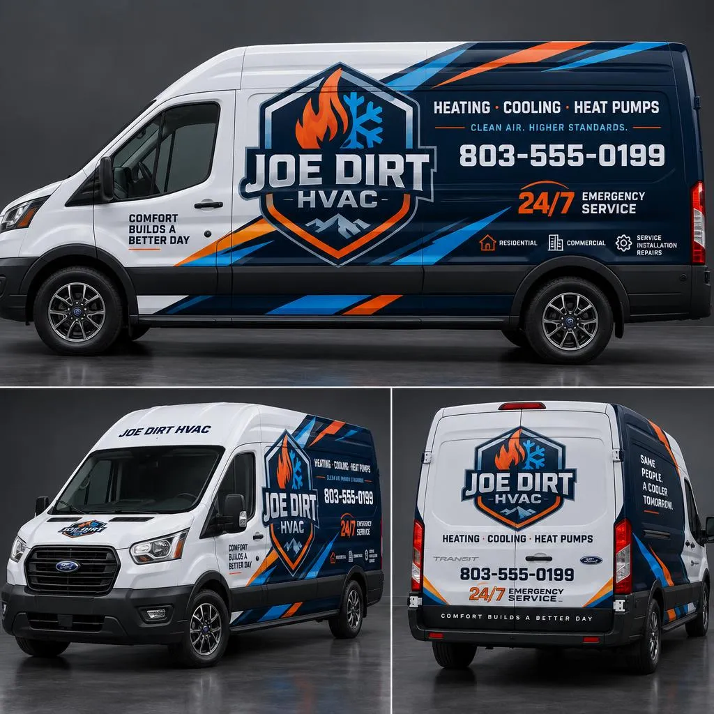
A Ford Transit That Sells While It's Parked
The high-roof Transit is the biggest ad the company owns. It sits in driveways for hours at a time, in full view of every neighbor. The wrap uses bold geometric navy, orange and ice-blue panels that read from across the street, a white field so the name pops, and only three things to remember.
- Name and crest large on both sides and rear doors
- 24/7 service badge so it's remembered for emergencies
- One phone line and the website. No service list clutter
- Panels aligned to the Transit's body lines so they hold up across a fleet
04 · Custom Desktop & Mobile Website
joedirthvac.com, Built to Turn Visits Into Calls
Same colors, same crest, same promise as the truck. A homeowner who saw the van on their street lands on a site that feels like the same company.
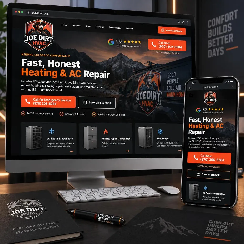
Emergency click-to-call
Fire-orange call button in the header on every page, and a sticky tap-to-call bar on phones.
5.0-star review trust badges
Google rating shown above the fold next to licensing and insurance, where people decide.
Service breakdown cards
Furnace, AC, heat pumps, maintenance plans and light commercial each get a card and their own page.
Online estimate scheduler
Three-field request with a time picker for people who'd rather not call at 10 p.m.
05 · Stationery & Field Sales Collateral
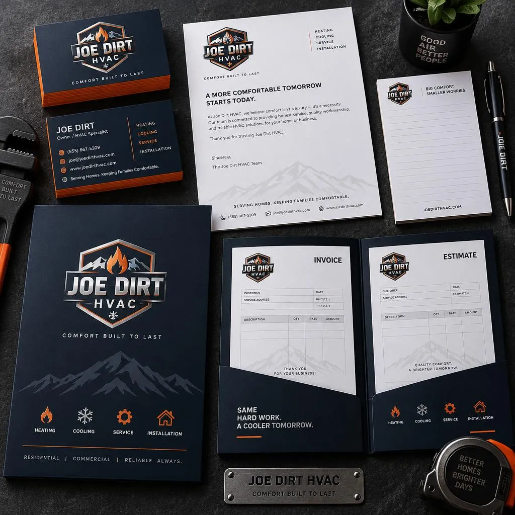
Paperwork That Backs Up the Price
The kitchen-table moment is where big tickets are won or lost. A tech who hands over a branded presentation folder with a clean estimate inside looks like a company that will be around for the warranty. One who writes on a generic pad does not.
- Thick business cards with painted fire-orange edges
- Estimate and invoice presentation folders with a pocket for rebates and warranty info
- Letterhead for commercial proposals and maintenance agreements
- Branded carbonless invoice pads for the truck
06 · Social Media & Marketing Collateral
The Brand Everywhere Else People Look
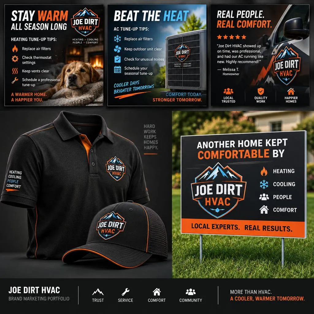
Instagram & Facebook Templates
Seasonal reminders, job photos and review shout-outs the office can fill in without a designer.
Embroidered Polo & Cap
The crest on the chest and cap. The tech at the door matches the truck in the driveway.
Neighborhood Yard Signs
"Another Home Kept Comfortable By Joe Dirt HVAC." Left for a week after an install, with permission.
07 · Growth Strategy & Lead Impact
Why Consistency Raises the Ticket
A homeowner rarely hires an HVAC company after one look. They see the van on their street, a yard sign two blocks over, a Facebook post from a neighbor, then they search and find the Google profile and website. When all of those look like the same company, every touch adds to the last one. When they don't, each one starts from zero.
That repetition is what builds the trust that lets a contractor quote a fair price instead of the lowest one, and what turns one install into referrals on the same street.
Fleet → Search
The van and yard signs create name recognition, so people search for the company by name instead of 'HVAC near me.'
Search → Google Profile & Site
The Google Business Profile uses the same crest, colors and photos, so the profile and site confirm what they already saw.
Site → Call
Click-to-call, reviews and the scheduler make the next step easy at any hour.
Visit → Bigger Ticket
Uniformed techs and branded estimate folders support the price at the kitchen table.
Job → Word of Mouth
Yard signs, review requests and social posts put the brand back in front of the neighbors.
How Many More Calls Could Your Brand Bring In?
Run your numbers in our free Lead Calculator, then talk with us about your own brand.
Want Your Company to Look This Put-Together?
Send a quick message about your logo, trucks, website or Google profile. I'll tell you straight what I'd change first — no pitch.